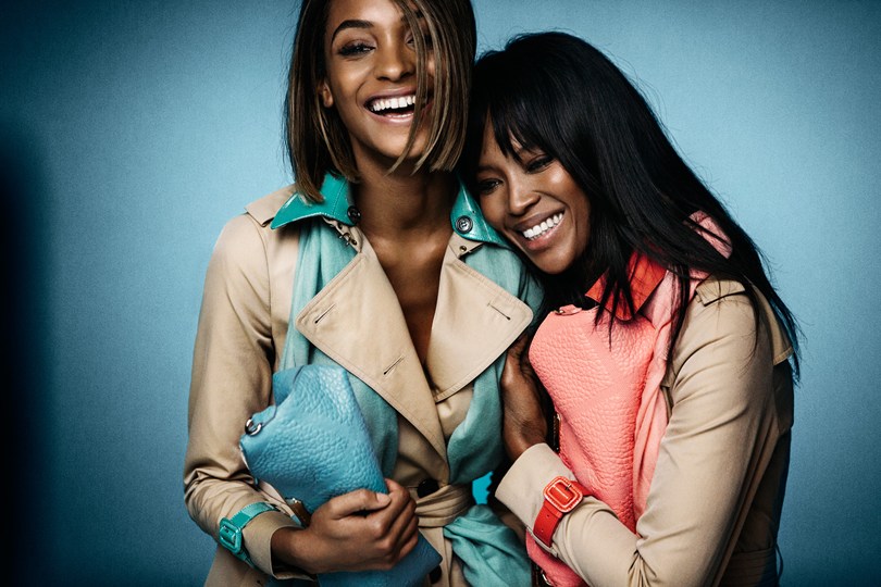
It’s been a long time since I did one of these ‘inspiration everywhere’ posts isn’t it? Which is weird because it’s not as if I haven’t been inspired recently, I mean I virtually live on Pinterest and usually have my face stuck in a magazine – guess I’ll have to rectify that, but anyway..
This image from the Burberry SS15 campaign is my current obsession.
I like plenty of things and I lust over lots, but this image right here, it’s struck me differently – I’m obsessed I tell you (it’s my screensaver on my phone and laptop right now), I look at it a lot…
The entire campaign is gorgeous, the mood, clothing, colours and let’s not even start talking about the heat that Ms Campbell and Ms Dunn are producing – it’s a lot right?!
Anyway visuals from the campaign are doing the rounds as you’ve no doubt seen, but this is the shot that’s haunted me the most, in a good way of course. The other day it finally dawned on me why I love it so much – it’s the colours! Not only do they work as elements in a beautifully styled image but they would also work perfectly as a colour palette for a room, great for someone who likes a bit of colour, but not too much.
For the more colour shy – use the beige / cream as your base colour, your neutral starting point and apply it to the larger areas/spaces of the room. Then introduce the two accent colours with your smaller pieces and accessories. If you prefer one accent colout over the other then use more of it. I’d throw some metallics into the mix too to add even more interest and different textures.
As well as being a breath taking image, it’s a great example of colour distribution.

So do you see what I see or is it just a shot of two (gorgeous) models in macs? Let me know!
you can subscribe to this ‘ere blog on bloglovin
see what’s rocking my world on instagram @decorbydelali
connect on twitter @decorbydelali
peep my pins on pinterest
find me on facebook


