Who doesn’t love a gadget eh?
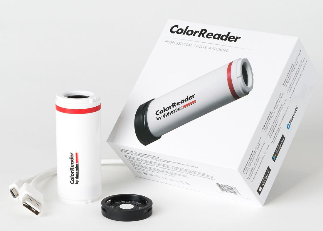
There are more and more apps/devices popping up, all designed to help make decorating choices a lil easier and I’ve come across a good’un – the Datacolor ColorReader.
If you read my post about the House of Colour, you’ll know that a fair few people in the UK want to use more colour in their homes, but there are some specific colours they’re scared to use in case it all goes horribly wrong.
Did you agree with the ‘scary’ colours? Or are you worried you’ll have wasted your money and time on a colour/scheme you hate?
Well whatever your particular colour fears might be, you can throw them to the side starting now.

It’s about the size of a large Pritt Stick (remember those?) or a really fat lipstick…
So what does a ColorReader do?
As the name implies, this handheld automated colour matching tool ‘reads’ colours. Actually let me do this properly – the blurb says;
“ColorReader provides accurate and fast color selection, enabling professionals and homeowners to identify the colors of paint and everyday objects. ͞
We hear time and time again from designers, homeowners and painters who’ve spent a lot of time and money trying to find the perfect paint to match their color inspiration. In the end, they settled for a color that still wasn’t quite right. We wanted an easy-to-use color identification tool that is affordable for all.
Susan Bunting, Datacolor’s Product Marketing Manager.”
All you have to do is, download an app (available on Google Play and the App Store), follow the setup instructions and you’re good to go. Simples.
So how would you use it? Let’s say you’ve got a cushion cover or piece of artwork in a colour you really love. Point/place the colorreader directly onto the colour, let it ‘read’ and the colour pops up in the app saved for evermore (or until you delete it).
I played around with the reader using one of my cushions and this is what I got.

Not bad eh?
Coordinate your colours
Once you have your readings in the app, the fun really starts (yes this is real fun for me).
You select the colour you want to experiment with, hit ‘coordinate colors’ and check out the palettes generated by the app. What palettes? Well you get to choose from four different types – analogous, complementary, monochromatic and triad to get the look you want.

So here are the possible palettes I get from the chartreuse-y colour on my cushion.


So now I have four possible schemes to work with, or to use as a starting point.
How and where you’d use these colours is another conversation, but this is a great way of getting your project going. For people who work with colour, create schemes or need colour swatches, this is a super useful tool, easy to use and is now a great addition to my kit.
Obviously this level of involvement in choosing colours is not everyone’s idea of a good time, or even necessary – but if it is, then you can get your hands on one from Amazon for £119.
Is this something you’d use? How would you use it?
** I was sent the Datacolor ColorReader by the company, to test and give feedback to their R&D team, BUT all my opinions are 100% honest cos you guys are great and I would never lie to you! I hope you found it useful **
Random sidenote – the mixture of English and American spellings of colour totally messed with my head!


