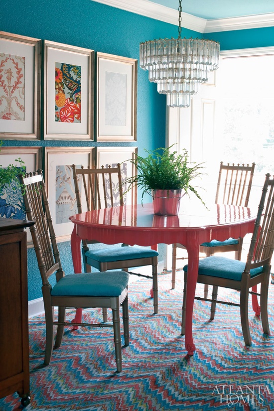
Today this dining area is making me feel warm.
The chairs and table aren’t really ‘my style’ per se, BUT I am absolutely appreciating the use of colour and pattern in this space.
Why exactly do I like it? Well…
That heavy glass pendant looks great here in the daylight, but I imagine it would look all twinkly and fabulous once the lights were on.
The six large frames on the wall are a great touch as they appeal to my symmetry loving eye, but the use of different pieces in each frame adds to the overall personality of the area.
The seat cushions, the walls and table are tied together perfectly by that very impressive flooring. Major props to the designer and/or homeowner who was saw that carpet and said ‘yep, this is the one’.
This space shows the impact you can achieve with a few clever choices. ‘In theory’ this space is plain – a table (no linens or styled accessories), four basic chairs, some artwork and a light feature. But by choosing two (just two!) main colours, the result is this (have you seen the ceiling?? So awesome!).
I love bold choices.
So would this put your off your main course or would you happily join me for an amuse bouche?
*Image taken from Pinterest, courtesy of Atlanta Homes Magazine
you can subscribe to this ‘ere blog on bloglovin
see what’s rocking my world on instagram @dbd10
connect on twitter @decorbydelali
peep my pins on pinterest
find me on facebook


