The thing about being a qualified interior designer is that everyone expects your home to be picture perfect gorgeous. It’s understandable really, but for me it’s not quite the case. Now don’t get me wrong, I don’t live in a tumbledown shack or anything, but my lovely little 1930s terrace has seen better days.
First reason, my tastes far exceed my budget (I know I’m not alone there) and secondly but more seriously, the house needs a rewire. There’s little point in making everything look pretty just to mess it all up again nah mean?
But having said that, I recently decided that it’s time to tackle the bathroom because the rewire won’t affect it massively and I’m fed up with it! So when I read that leading tile specialists Walls and Floors were running a competition for bloggers to win a room transformation, I was all ears.
Planning my new bathroom…
Currently my bathroom consists of a tired white suite, white tiles, some blue and walls partially covered in DIY dark wood panelling – all courtesy of the previous homeowner. Not the worst bathroom in the world, but very, very dated, boring and very ‘not me’.
As much as I love colour, I do quite like neutral bathrooms (gasp), but I’m all about bringing in the colour and personality with accessories and details.
Floor
My bathroom floor is a tiny area. Some might say go for large and light coloured floor tiles to make the floor feel bigger, but I’d rather go bold and make a statement with the little space that I’ve got. So I looked for patterned tiles with a neutral background to keep the space light-ish, but definitely interesting. I’m a fiend for geometric patterns so I was on the look out for some good stuff.
Walls
As I’d settled on a busy floor for my dream bathroom, I decided to dial it back a bit on the walls and go for a mixture of a simple tile and complementary paint.
Accessories
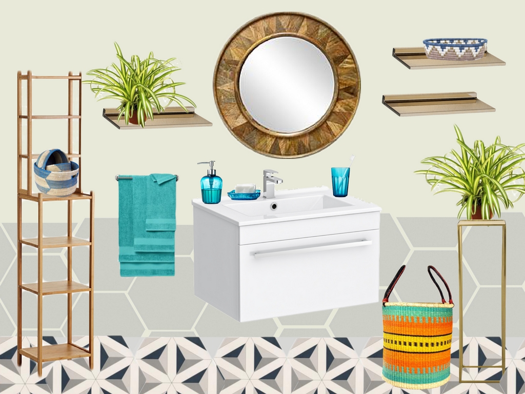
Blue is my favourite colour so clearly, that’s what some of my accent colours and accessories have to be, in a mixture of textures. In my world gold is never out of style so some of that has to be in the mix – and of course, we must always include some greenery.
Decisions, decisions
I spent hours, yes multiple hours, working my way through the Walls and Floors site, but eventually managed to create a shortlist. Take a look at my Pinterest board and see the process I went through…
From that shortlist came the brutal process of elimination, ok not brutal really, but there’s so much pretty it was difficult to choose – but choose I did, and here’s what I ended up with…
As I mentioned I started with the floor and chose the gorgeous Malmoe hexagon tile. I LOVE the shape of it and the shapes on it – it’s a perfect combination. For the wall I wanted to carry on with grey, but didn’t want it to take away from the floor, so I chose another hexagonal tile, but in a soft grey. These tiles would go halfway up the wall and the remainder would be painted. Throw in some storage, open shelving and bright accessories et voila!
So there you have it, a fresh space, that’s a little busy but still kinda calming – not for everyone, but it’s oh so me.
I’d love to know what you think. Would you take it all or just some bits of it? Let me know.


