Every year, everyone interested in decor trends/colours, eagerly waits for big brands to announce their colours for the coming year.
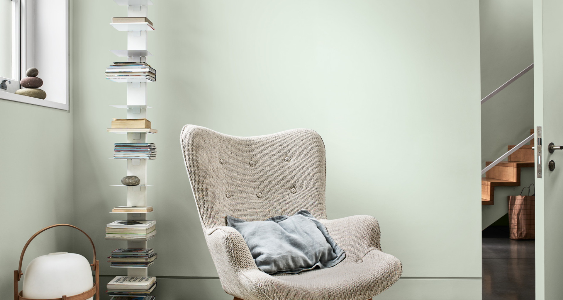
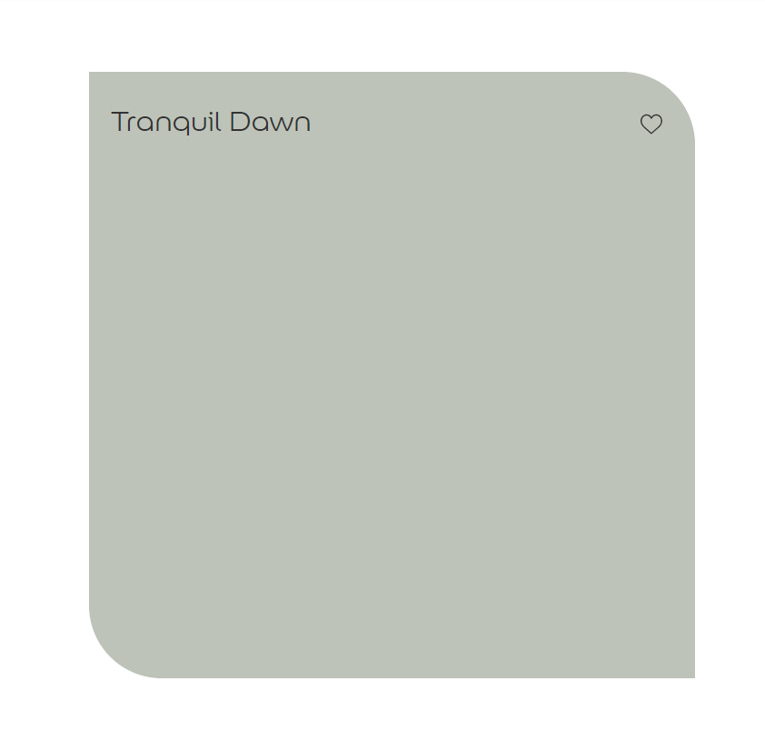
Dulux are usually up first with their announcement and this year they gave us Tranquil Dawn. The good folks over there describe it as;
a colour inspired by the morning sky, to help give homes the human touch. This versatile shade of green can be used to create spaces for care or for play, to find meaning or for creativity…
Meet Tranquil Dawn
Some people place (imaginary) bets on what they think the colour of the year is going to be and there’s a fair bit of debate. I’m never invested to those levels, but I do like to have a look-see once it’s revealed.
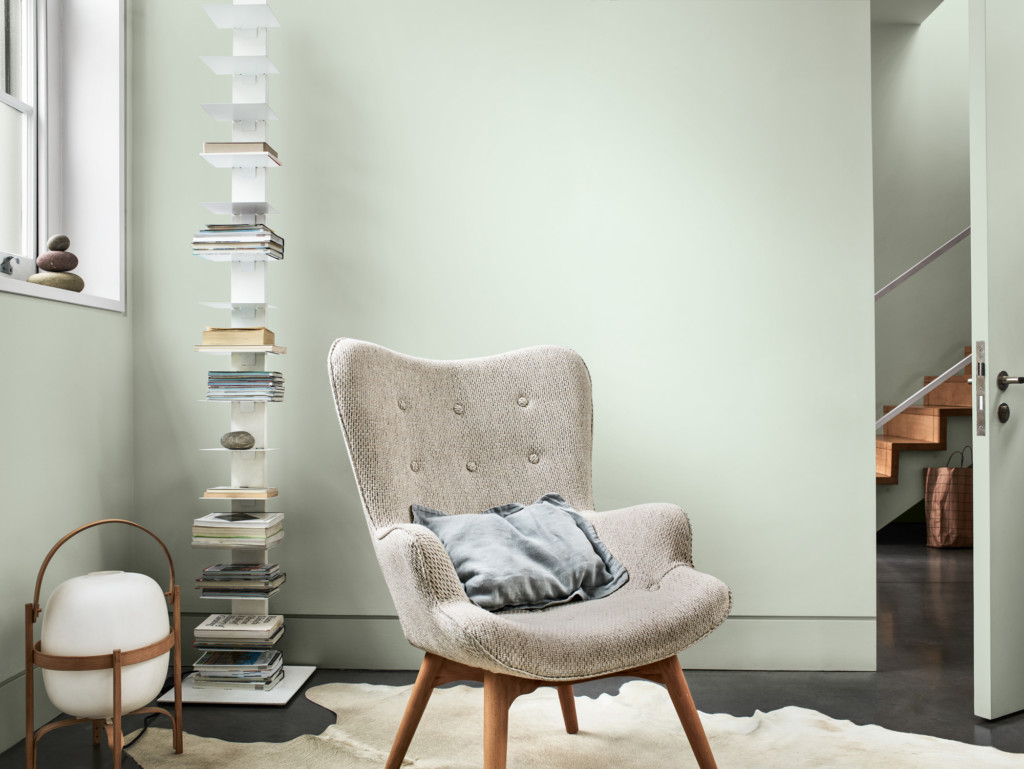
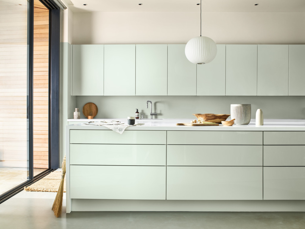
I think I like it!
It looks really good on those kitchen units and is the kind of green that would work in most rooms.
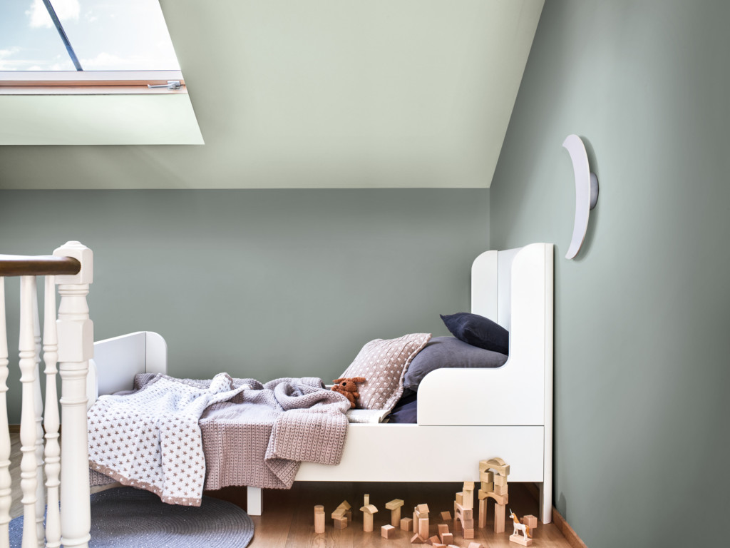
It’s neutral enough for people who prefer a low-key palette, but there’s enough colour for those who prefer that too!
I’d definitely pair it with a punchier colour, maybe something deep or even jewel toned for a lively combination.
Head over to Dulux’s website to find out more about their 2020 colour of the year, how to use it and the complementary palettes that work with it.

